With an extensive background in painting, drawing and photography, Fred Parker has freed himself to do exactly what he wants to do. He is not bound by conventional labeling to be just a painter or a photographer. This pigeonholing just won’t work for him. In Parker’s case, his ends justify a wide selection of means—limited only by his imagination.
Parker's ends are satisfying and often thought-provoking images that appeal to many visually responsive viewers. His means are whatever he needs to attain that goal. Often it is oil painting or pastel drawing, but just as often it is the technique of cliché-verre, loosely translated from the French as "picture-glass." Combining elements of both drawing and photography, this procedure discovered during the last century allows for the creative freedom of hand-drawn images to be easily reproduced by the action of light on a sensitized surface.
To create the traditional photographic print, a negative is first created by exposing film in a camera. After developing that film, the resulting negative is either contact printed or enlarged by passing light through it onto a light sensitive material such as photographic paper. This second "negative-negative" is now seen as a positive image—what we call a photograph.
With the cliché-verre, on the other hand, an image is drawn, painted or etched by hand onto a transparent material such as acetate or glass. No camera is used. This initial drawing must be created as a negative image. This "negative" is then printed on photographic paper in a darkroom in the same manner as a conventional photograph. The resulting print (a cliché-verre) is now a positive image—a photograph made without a camera.
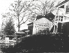
One of Parker's cliché-verre prints, "Sonoma Hills"
![]()
is a good example of how his images evolve. It was created in response
to the serene environment of Sonoma Valley in Northern California where
the artist now lives and works.
"I started out making two smaller images that were going to be side-by-side as a set, but once I saw them I realized they would look better as a single image."
The two negative drawings were done on translucent, matte acetate sheets with pencil, joined to overlap, and taped to a large sheet of glass. They had been drawn with pencil in the conventional manner, except they were negative images. Thus every dark area on the clear acetate would appear as a light area in the final print. The pencil marks at the side of a tree trunk or branch, for example, became a sunlit highlight and any transparent area without marks became the dark and shadowy areas in the final print.
"The drawing (taped to the sheet of glass) was laid down on a sheet of photographic paper in the darkroom and I turned the light on with a timer. The exposure was probably for about 45 seconds with a very low, single filtered white light (a refrigerator light bulb with a couple of pieces of plastic to diffuse the light). During the exposure, if the light was falling off at the corners, all I had to do was move the light source."
After straightforward photographic development, fixing and washing,
the print (now a black and white positive image) was further modified
by hand painting with oil paint.
A full range of the creative process can be seen in Parker's work—from
his initial perception, influenced by his background and materials,
through the growth of the work itself as it takes on its own life, to
the final impact upon viewers of diverse backgrounds and aesthetic perspectives.
A Master of Arts degree in painting, from the University of California,
Davis, followed his Bachelor of Arts degree from San Francisco State
College, where he majored in both photography and painting. He has since
been an instructor of drawing, painting, photography and the history
of photography in universities and colleges from California to Wisconsin
and Missouri. In addition to his tenures as director of several university
art galleries, he was the first Curator of Photography at both the Pasadena
Museum of Modern Art (now the Norton Simon Museum) and the Santa Barbara
Museum of Art. He has organized hundreds of exhibitions and has written
or edited catalogues for many of those exhibitions. In 1974 he served
as a panel member for the National Endowment for the Arts, Visual Artists
Fellowships and somehow found time to show his own art in dozens of
group exhibitions and one-man shows.
Parker was the first Executive Director of the Friends of Photography,
Inc. and was editor of the first eight issues of their quarterly, Untitled,
the non-title which he initiated. This West Coast organization based
in Carmel, California, not far from the hallowed shores of Point Lobos,
was influenced predominately by photography in the tradition of Edward
Weston, Wynn Bullock and Ansel Adams. No doubt because of his more catholic
art exposure, and knowledge of the wider history of photography, he
shook things up a bit.
The first
issue of
Untitled
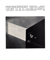
featured
an article about Edward Weston, duo-toned printed on glossy paper, ("This
is what they wanted, really classic, it dealt with Weston… who
else… you have to start with God."). It also included an
essay by Weston’s daughter-in-law, Dody, wife of Brett Weston.
The second issue of Untitled
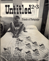
was
completely different. The cover featured a multi-negative self-portrait
by photographer Jerry Uelsmann, sitting on a bed with his knees apart—in
his under shorts. Inside, in addition to photographs, were discussions
about creativity, sculpture, dance, acting, advertising, and even right-left
brain research. There was even (gasp) poetry. And to top it off, it
was all printed on newsprint. Several outraged subscribers immediately
dropped their memberships in response, but the total membership shortly
tripled. After two years of presenting the widest possible view of photography,
organizing exhibitions, workshops, lecture series and publications;
all the while sparring with trustees, Parker was fired, an inevitable
event which was as much a result of Parker’s continuing growth
as an artist as it was the result of trying to please a group of trustees
who disagreed with each other—several who resigned in protest
to his termination.
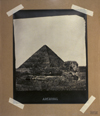
His in-depth knowledge of and appreciation for the history of photography
have given Parker many ideas for his own images. Sometimes his allusions
to other photographers or their photographs are obvious, at other times
they are hidden and obscure. In one cliché-verre, Egypt
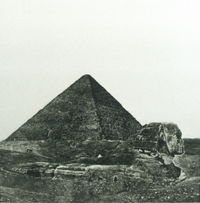
Parker’s image is a "recycled" tribute to Francis Frith’s seminal influence upon travel photography in 1858. In another version of that same image, Archival, Parker plays with the illusion of permanence in photography. (using masking tape to secure the print to cardboard... very unarchival)
Likewise, with his cliché-verre, Arizona,
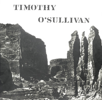
he recycles the famous photographic image of Canyon de Chelly in Arizona
recorded by Timothy O'Sullivan, as part of an official U.S. Government
survey expedition of 1873.
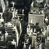
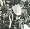
The bird's eye view of The
Flatiron Building
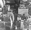
(barely
showing the building at the top edge of the image, lost in a jumble
of contemporary brick and glass), is also a tribute to photography's
past—in this case a multiple tribute to a long list of photographers
who have made memorable images of the famous New York building, including
Alfred Stieglitz, Edward Steichen, Alvin Langdon Coburn and Bernice
Abbott, among others.
Using the same negative drawing to create a cliché-verre/photogram,
during the exposure Parker placed diverse objects over the paper to
create Dancing
Dolls
Self Portrait (mimicking an image by Man Ray)
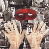
and the simultaneously comical and menacing Flyswatter.
In spite of his familiarity with photography, Parker doesn't consider
himself a technician. The technical aspects are under control, but are
no more than another set of useful tools.
"I am not concerned with such things as Ansel Adams’ Zone System… my talent is more in my handwork than in my ability to deal with formulas and calibrations typical of photographic craft. I don't have an enlarger. I don’t want to deal with all that stuff. I'm just fine using very simple chemistry and I don’t care when it fluctuates a little. If I get a speck here or there, I'm not going to pull my hair out and throw the paper away. I'm going to make that speck either invisible with whatever I do to the print later, or I’m going to make it part of the image. I consider such specks to be gifts, not as flaws."
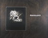
One of Parker's most ambitious projects, Connotations is a portfolio of ten cliché-verre prints, each archivally printed on Kodak Ektalure paper in an edition of twenty-five. Each print is meticulously over-drawn by hand with copper colored pencil to give the tactile sense of soft fur. Thus each print (250 in all) is a unique production. Each is specifically designed to be thought provoking.
"I'm dealing with a visual, verbal and tactile combination, and I call the whole series Connotations. I’m building upon what I have experienced—that there are interesting relationships between words and images and feelings… where the imagination makes diverse and unexpected connections. Hopefully, for the viewer, each print offers a multiplicity of personal meanings—not just mine."
Several of the Connotations prints use words that refer to photographic history. Equivalence
for example,
is a takeoff on Equivalents—a title given by Stieglitz
to his series of cloud pictures in which he attempted to capture and
convey human emotion.
Decisive
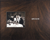
is a reference
to the book Decisive Moment—a pictorial anthology by
French photographer Henri Cartier-Bresson.
Premonition
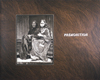
is a more esoteric allusion to a nineteenth century photograph made by Henri Lemasson
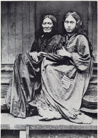
and then used by painter Paul Gauguin as a source for one of his richly colored and sensuous Tahitian paintings entitled Mother and Daughter.
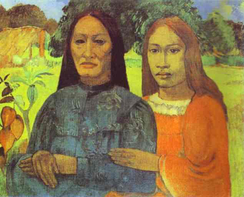
"Premonition has a lot to do with the relationship between these two women. The younger woman knows (has a premonition) that she will in time become the older woman. There is fear and a sense of death’s inevitability… combined with life’s simplicity and beauty. No wonder Gauguin was attracted to this particular photograph."
is more easily appreciated by a Western lore fan, or by someone who has seen the movie Butch Cassidy and the Sundance Kid.
"It’s not just a snapshot of anonymous individuals. It happens to be a hand drawn copy of a photograph made in a photographic salon of the famous Butch Cassidy and his girlfriend just after he and the Sundance Kid had robbed a bank and spent all their money on clothes (and whatever). This is not what it seems—these people are crooks. All assurances aside, photography can still tell a big lie."
The cliché-verre
process can have a multitude of appearances depending on the materials
and how they are used. For example, if the negative drawing (or painting)
is on a thick material such as glass and the painted side is down (in
contact with the photographic paper) the image will be sharp and in
focus. If the glass is reversed, with the painted side up and not in
contact with the surface of the paper, the resulting image will be blurred
and out of focus. During the last part of the 19th century, when soft-focus
was much in vogue, cliché-verre artists intentionally aimed for
this blur. They also used tinted papers or different printing processes,
such as cyanotype, to vary the colors.
Many variations are of course possible when the negative drawing is
initially executed. Pencil, ink or paint can be applied with brushes,
pens, sponges or cotton swabs—the additive method
or the opposite, the subtractive method, where material
is removed by scratching (ink on glass) or erasing (pencil on acetate)
to better allow light to penetrate the surface of the negative image.
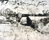
The cliché-verre Rural
Missouri
provides yet another variation. At first glance the binocular looking image appears to be a positive image on one side and, placed beside it, the negative from which it was produced. When studied more closely it becomes obvious that the objects within the images are not quite in their correct positions. That’s because the individual images are actually two separate views from slightly different perspectives. The common subject matter unifies the overall composition while the variation in viewpoint and the negative/positive flip induces tension.
"I did one negative drawing and one positive drawing side by side on matte acetate. When printed, the positive side became a negative and the negative side became positive."
Another variation to the process was explored after Parker made a conventional pencil drawing of a Midwest Backyard.
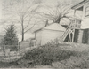
After completing the drawing, he placed it under a large sheet of glass. He then painted a negative of the image on the glass
tracing the drawing (reversing the tonalities) using a brush with ink. By mixing ink with water as he worked, washes of varying densities were produced which would give corresponding variations of tone when the ink painting was later used to print a cliché-verre.
"I might even put down some ink and then scratch through it using a toothpick or use a knife to carefully trim a line. The resulting cliché-verre
when compared to the pencil drawing, was aqueous rather than linear in character and much stronger in tonal contrast."
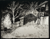
Later in that same backyard,
"I put a sheet of glass on my easel. Looking through the glass (from a specific and consistent location with one eye only), I painted a negative of the scene with ink and water. Much of the negative painting was done with a brush. A felt-tipped pen was used for some sections. To create crisp lines, ink could be removed by scratching with a sharp tool. Some of the flower shapes in the foreground are the result of patting with a small sponge."
Fred Parker is part painter, part photographer, and all artist. He has
attained that balance of a mature craftsman who exhibits control of
his medium and reveals the nature of the materials used, while at the
same time permitting his own personality to show through. In addition
to photography, he uses his pencils, brushes, toothpicks and cotton
swabs to make the kinds of images he likes.
"I use all these tools to do whatever I can to make an image. Sometimes the results look more like Edward Weston or Ansel Adams and sometimes they look more like Van Gogh. I don't care. I have to be comfortable with what I am."